The Best Color Theory Tool for Designers
Color Harmony
Since the 1600s, color has been pivotal in art and design. Colors paired together in harmony can have a lasting impact on the observer, so much so people will remember your creation or design months down the road. We make judgments on objects, people, brands, and anything based on perfectly (or imperfectly) paired colors. It is also one of the most engaging elements of design. Color harmony grabs your customer to see the cohesion of your brand or project. But, we can perceive up to 2.8 million hues which is extremely overwhelming. How do we know what colors to pick for our project?! So let’s get down to it.
Color Theory Basics
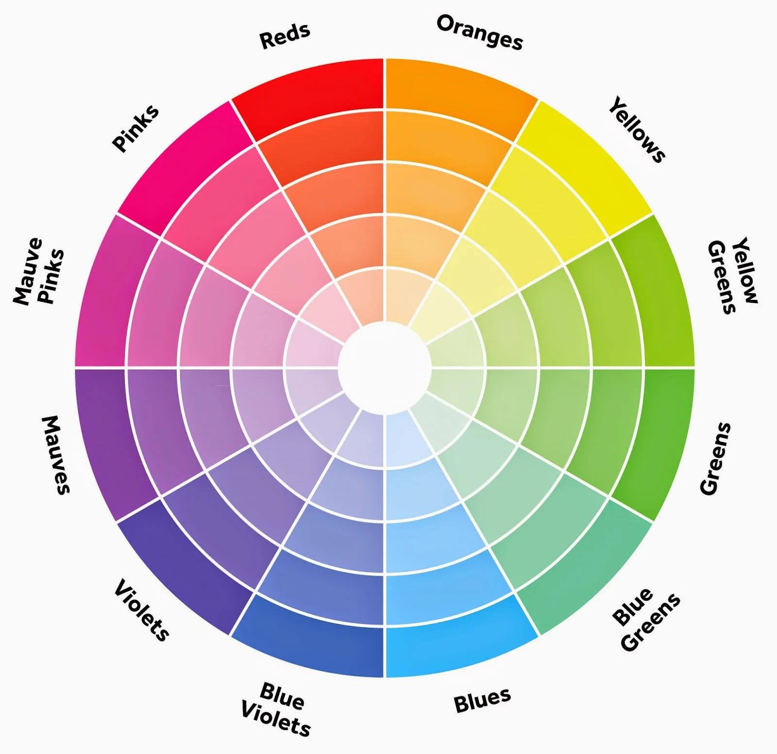
The history of the color wheel is important, but understanding the basics is really all you need to know. The color wheel is a visual way Isaac Newton logically presented colors; and it still works perfectly. The three-part color wheel is made up of yellow, blue and red which are referred to as the primary colors. All color hues are thought to be made from these three colors (but there is some debate in this; ain’t nobody got time for that). Secondary color hues are made of green, orange and purple. Lastly, there are tertiary color hues that are made up of primary and secondary. Example: red-orange, blue-green or yellow-green. If you’re really into it, you can also call these color hues: amber, vermilion, chartreuse or magenta. But there is a little more. A color hue is made by mixing different colors together. When you change the shade you add black, when you change the tone, you add gray and when you change the tint you add white. (If you are interested to dive deeper into the history and psychology of colors, there is a great article by Jen Reviews to check out!)
Formulas for Color Harmony
Basically, the human brain rejects what it cannot organize. Visual interest comes from basic formulas derived from the color wheel.
Analogous: Colors that are side by side on the 12-part color wheel. Colors like green, green-yellow and yellow.
Complementary: Two colors that are opposite on the color wheel. Colors like green and purple.
Monochromatic: Colors that come from the same hue but different shades, tones and tints.
Triad: Colors that are evenly spaced around the color wheel. Colors like green, orange and purple.
Compound: Beginning with one color and its analogous color, then paired with both complementary colors. Example: green, red, green-yellow and red-orange.
The Best Color Tool
As a designer we have our favorite colors; heck as people, we have our favorite colors. What if we could choose any color and plug it into a free algorithm to find formulas for color harmony?! You can! It’s Kuler by Adobe. Check it out here! If you don't have Adobe Creative Suite, no worries. Here is another great, and free option.
I hope this was helpful for you! Please comment below about any questions you have or things you would like to hear. I’m so excited to start this blogging adventure, but it’s more exciting with friends and a community. Let’s do this!


